Silicon Valley Bank
Throughout my tenure at SVB, I successfully designed and launched data-driven product solutions that elevated NPS scores, optimized client experiences, and boosted retention and acquisition rates. I contributed to the entire client journey, starting from research and wireframing to prototyping, visual design, and UI implementation. I also developed design systems to ensure consistency and focused on delivering accessible and user-centric experiences.
Client Onboarding Application - UX/UI Enhancements
In this project focusing on onboarding application flow enhancements, I problem-solved for various UX/UI challenges spanning complex user role and ownership entity structures, navigation improvements, and API requirements. Special attention was paid to accessibility best practices when infusing SVB’s updated branded color palette, fonts and other iconographic visual styling across both mobile and web platforms. Functional Figma prototypes were created to gather buy-in from stakeholders and alignment with dev implementation.
Achieved a 33% reduction in questions, 48% reduction in screens, and 33% decrease in average application completion time.


Icon Branding Update
Following an extensive end-to-end internal and competitive iconographic audit that I led, I worked closely with SVB’s Creative Brand Director to map the inconsistent icon usage across SVB marketing sites and products, as well as icon trends being used by our competitors. This foundational work was performed ahead of a slated org-wide overhaul of our icon sets, during which I tested limitations of Material UI icons to see if we could adequately communicate our product value props and properly utilize our updated branded color palette for interactive experiences. I presented this work to SVB’s Head of Brand and Advertising, as well as the CMO.
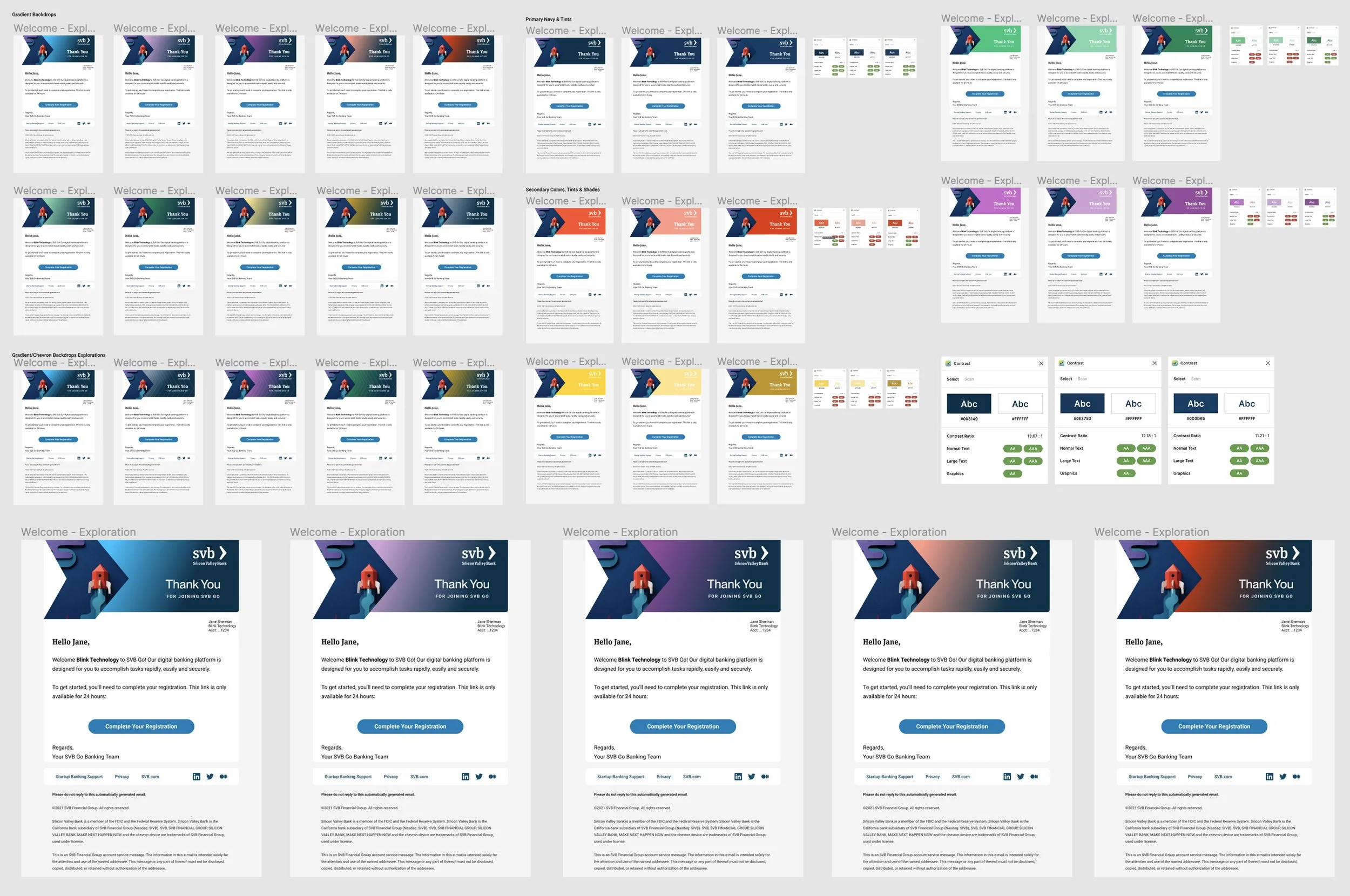
Color Explorations for Brand Design System
During the overhaul of SVB’s brand color system, I was tasked to test limitations of color applications in our product experiences. In the case below, I explored various approaches using the branded colors and patterns within our email communications, to ensure accessibility adherence with suggested color and contrast ratios.
This exercise informed future brand and marketing initiatives for best uses of the updated color palette.
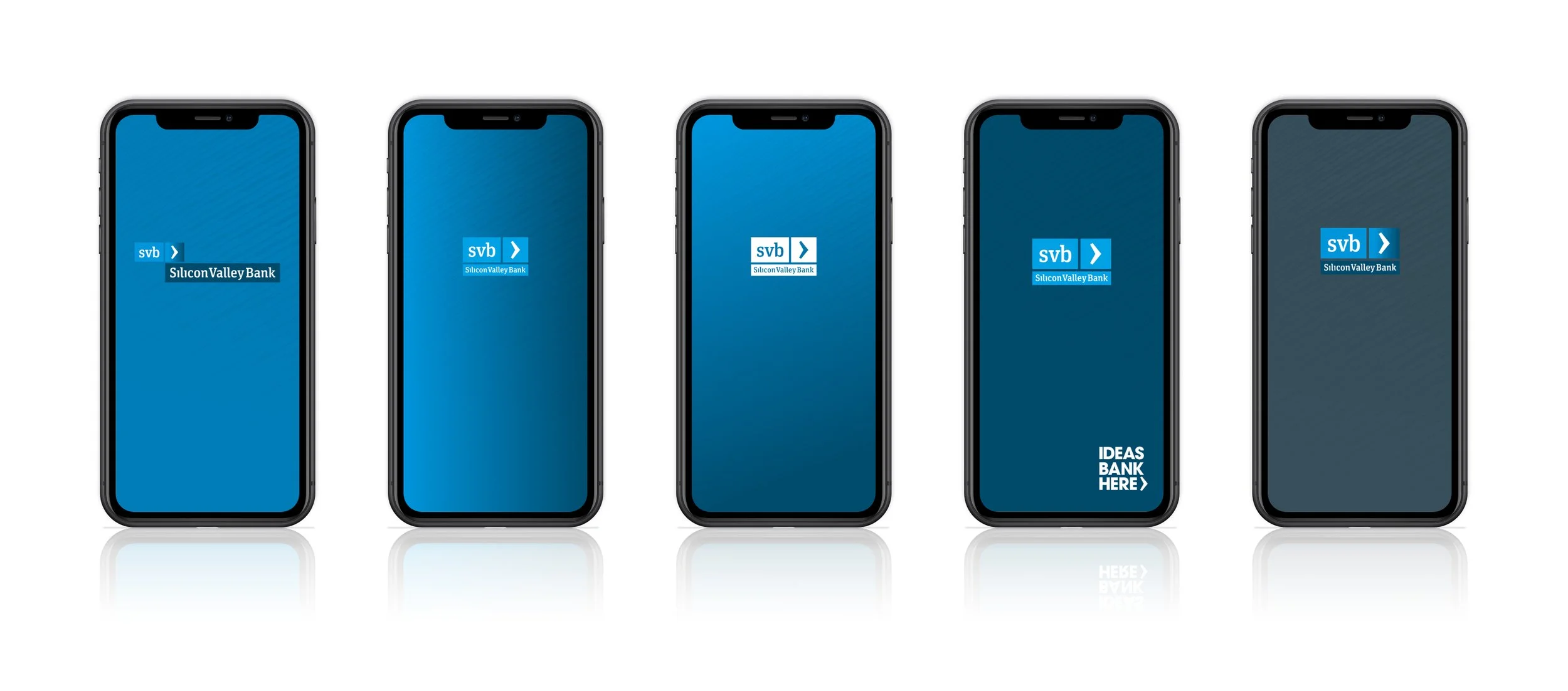
Mobile App Splash Screens
Branded logo mock up explorations for SVB’s mobile banking app.
Founders Platform - Stealth Innovation Product
During this stealth innovation product initiative, as the only designer on the team, I developed this concept from sketch to mid-fidelity wireframes and illustrated the breadth of the suggested feature set. Lightweight prototypes were created to facilitate conversations with key stakeholders and get buy-in from leadership for this new product offering to support new founders.
Initial Concept & Wireframes


MVP Screens
In the next stage of this initiative, I led design of the MVP while working closely with development to assess feasibility of implementing features and partner APIs from early onset. Under my direction, a contract designer and I built cross-platform user flows and established usage of Material UI design system, all implemented within an agile framework.


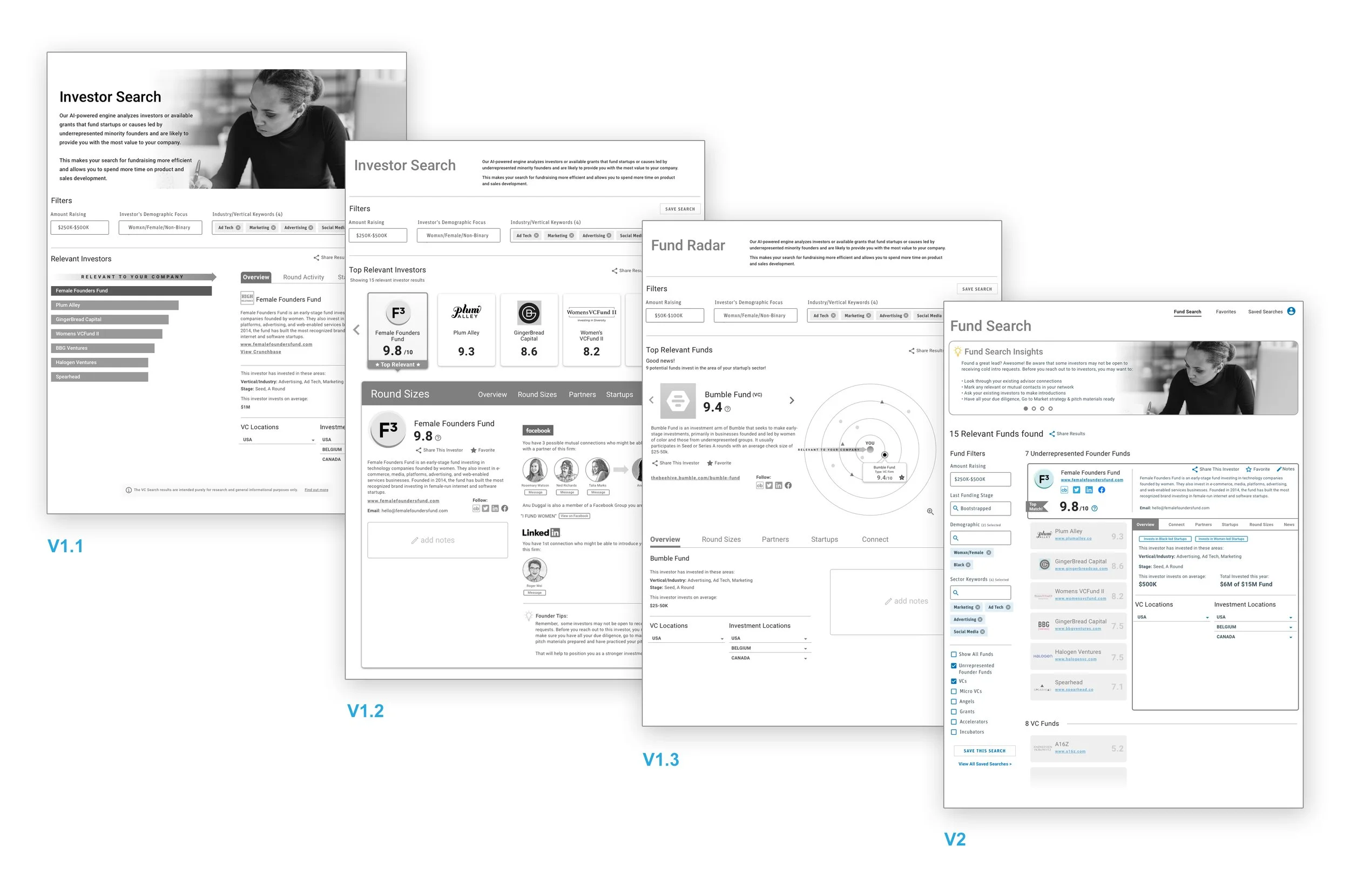
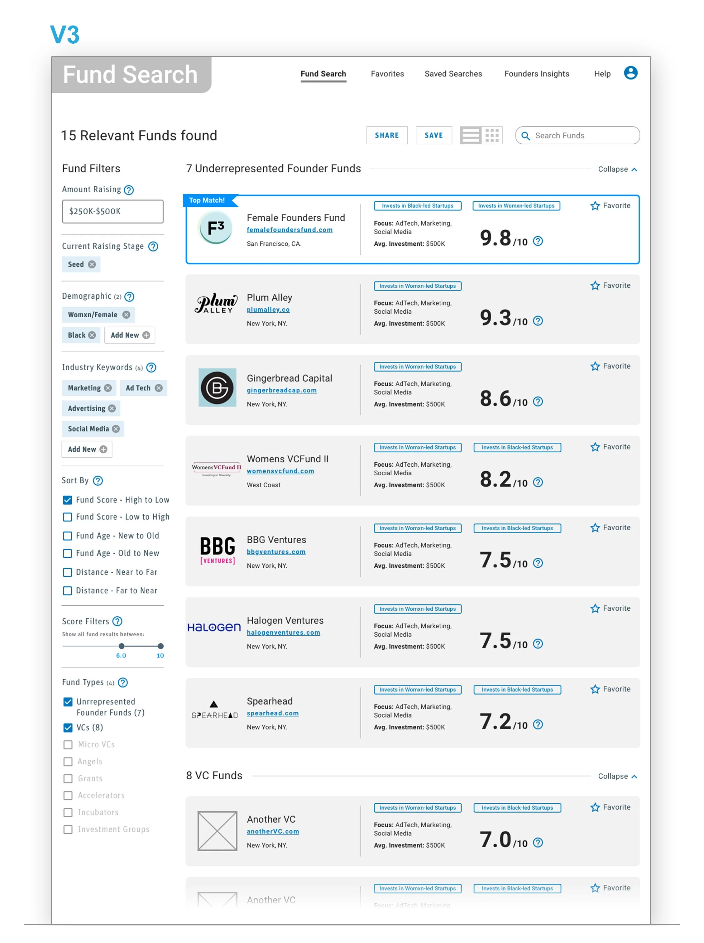
DEI Founders Concept Prototyping
Leveraging a partner’s VC search/match API, we sought to validate impact and perceived value with a focus on amplifying underrepresented Womxn/BIPOC founders. I partnered with a UX researcher to develop an interview script, and adapted the features from the MVP above to create a lightweight mid fidelity prototype. Over the course of three weeks, after each round of founder interviews, we rapidly iterated on our prototypes each week. In the end, we uncovered incredibly powerful and moving insights regarding the vast challenges and headwinds these founders encounter to find investors, how they leverage their personal network across platforms to learn and gain investment leads, and how the language that is used across the innovation/banking economy creates or weakens trust in the establishments.
Storyboarding
In order to bring awareness and realism to product leadership about our client needs and pain points, I was tasked to illustrate user-centered vignettes that tied in product feature concepts. Using stock imagery as a jumping off point, I sought out imagery that evoked delight or frustration to illustrate user scenarios interfacing with our products. Once feedback was collected by multiple product owners, I iterated on the designs until I arrived at a point of buy-in and signoff.
This facilitated alignment on feature roadmap planning amongst leadership, design and development, conveyed product feature ideas and most importantly, helped to root key capability discussions in the client’s needs.


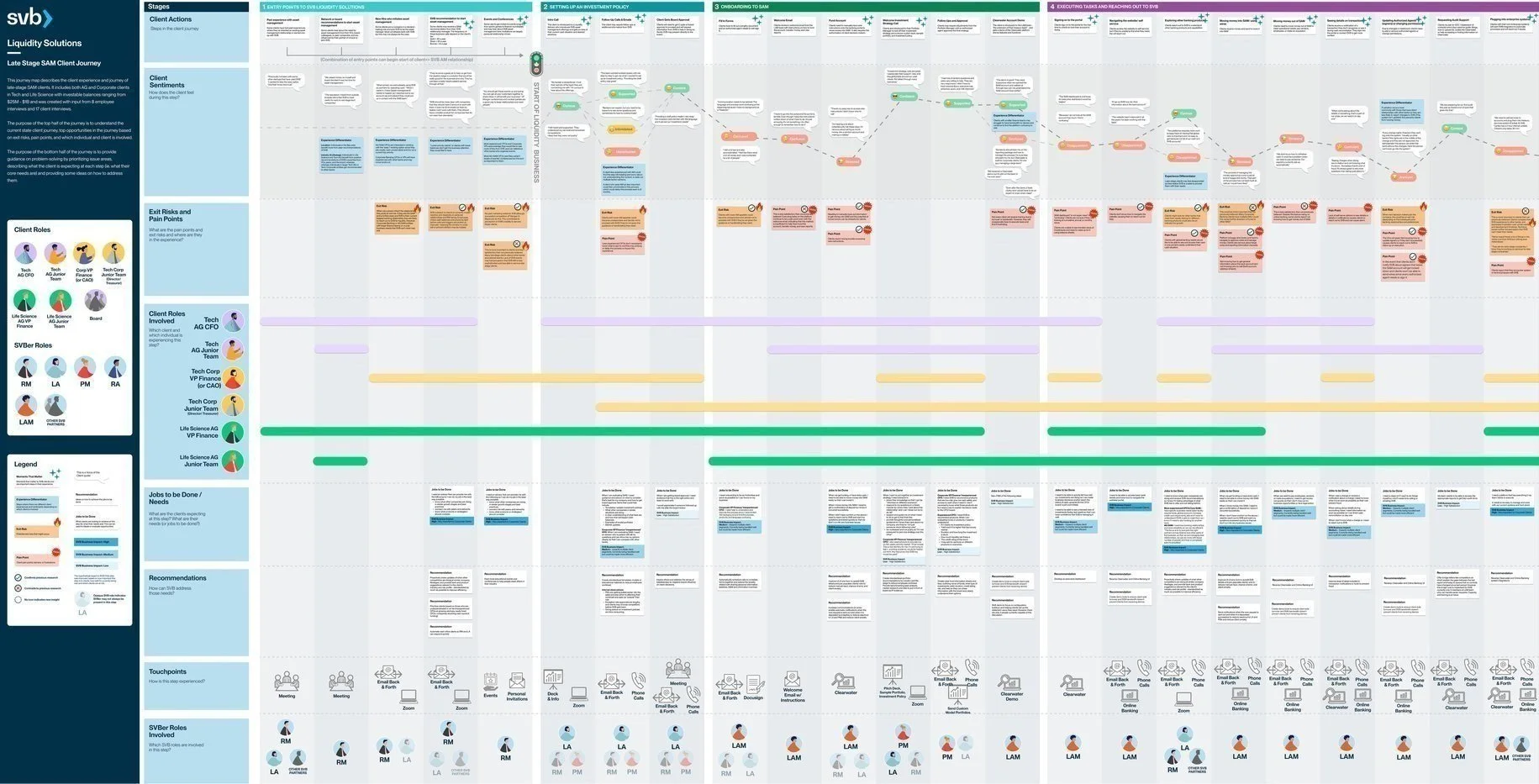
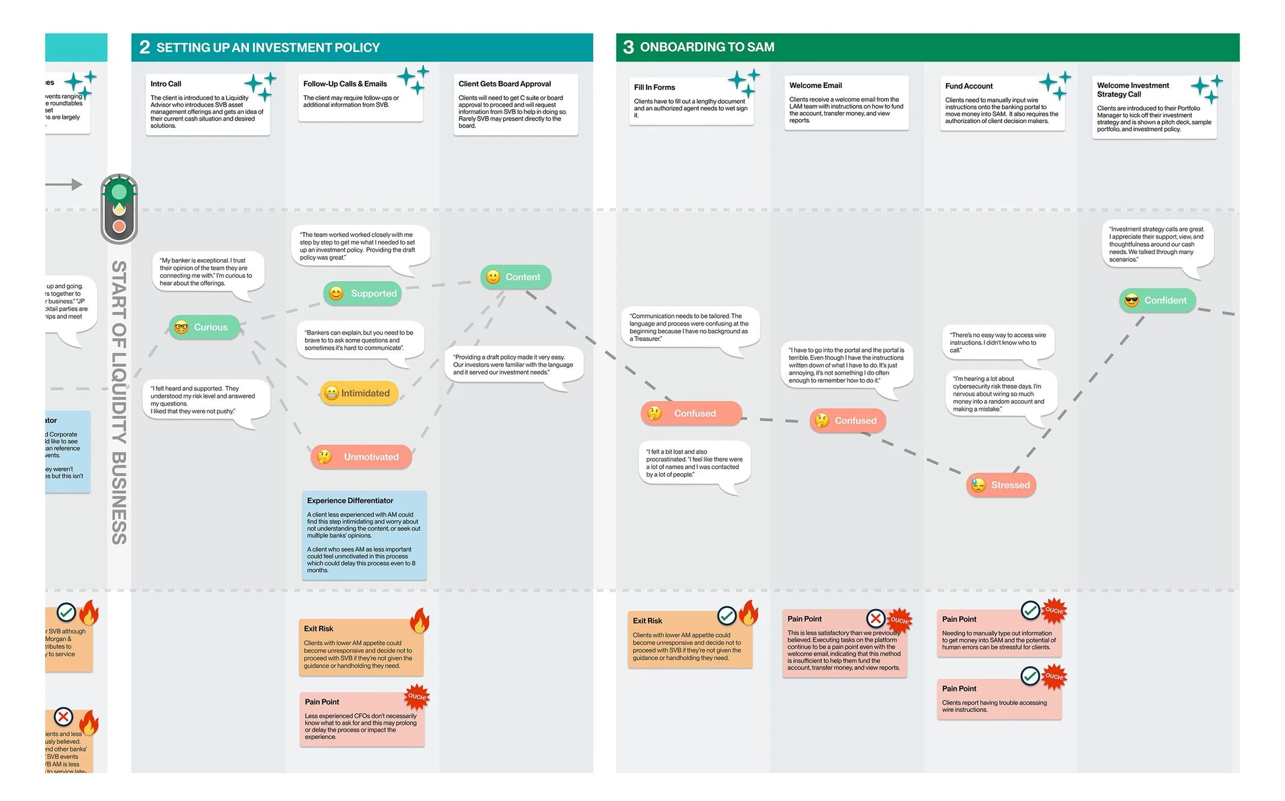
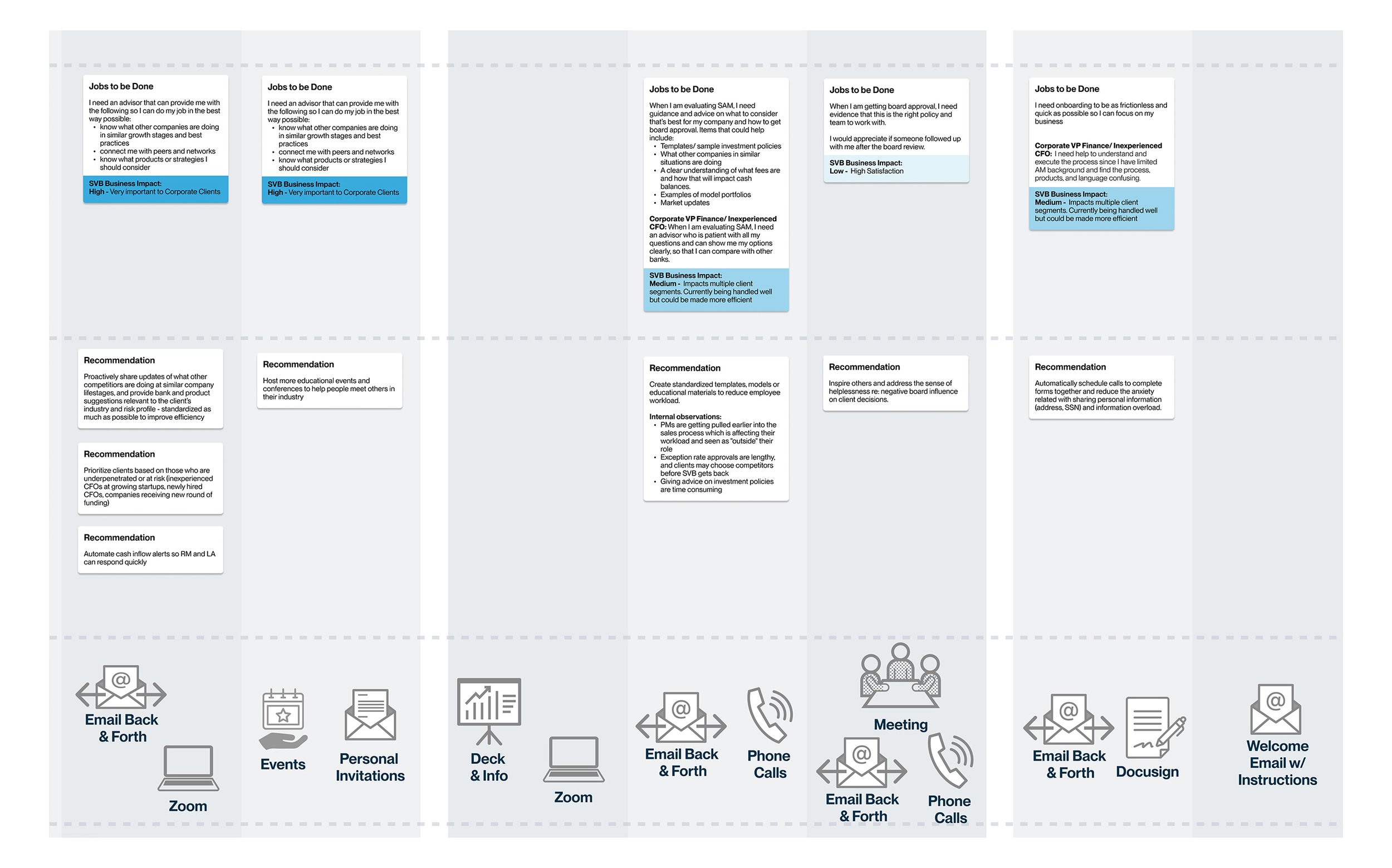
Journey Map Component System
Based on the Liquidity Journey Map template I created below, I built a component-based design system in Figma to speed up our research team’s future workflows and reduce the amount of time spent building journey maps.
This component template was leveraged by another product team that were building multiple journey maps for high profile client personas they were working on.
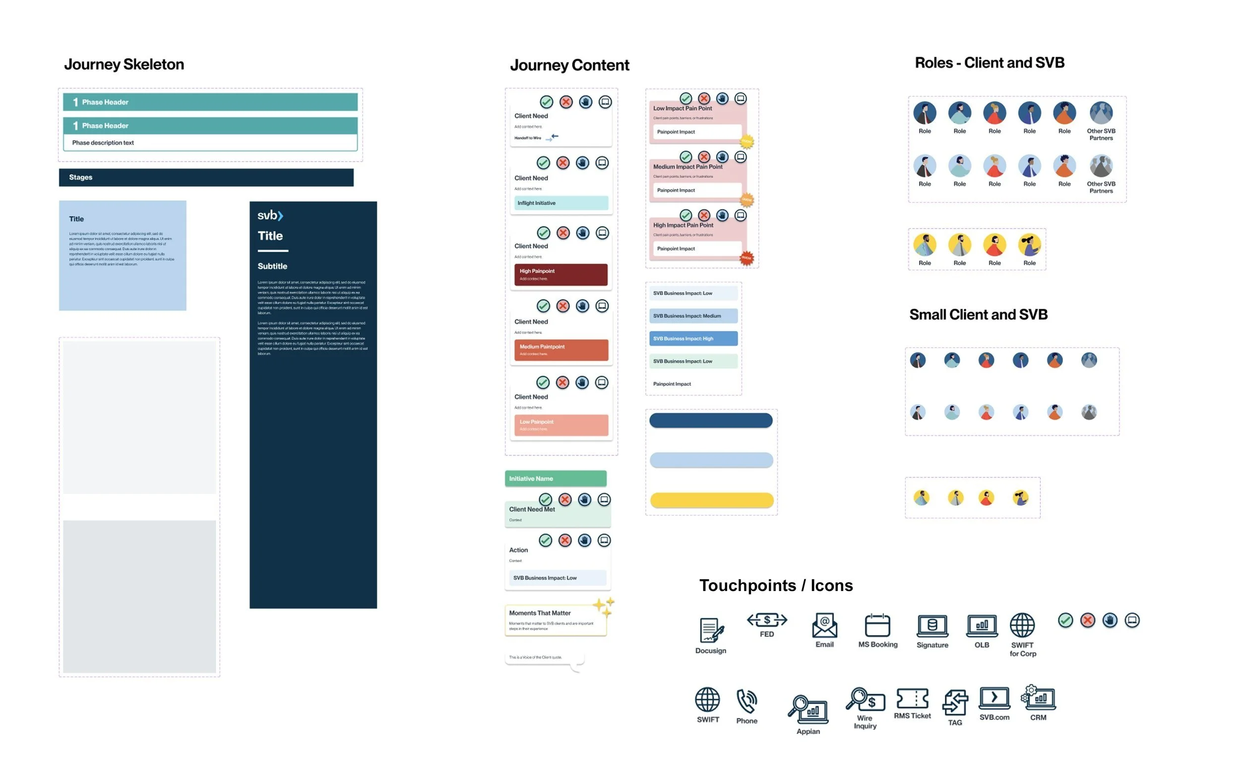
Liquidity Journey Map
Working alongside a team of researchers on a 1.5 year discovery engagement, I helped support the research process by leaning in on the formation of testing protocol and the synthesis of gathered insights from employees and clients that were interviewed. While being immersed in the research process on the day to day, my role was dedicated to creating the visual narrative for the client needs, pain points, jobs to be done, business impacts, etc. through journey maps and user personas.
These artifacts were leveraged to educate new hires about the client experience and early stage clients on what to expect in terms of impactful milestones and challenges along their journey.